in stride llc
client website
Role: UX, UI, Consulting
Duration: 2 months
Overview
Client: In Stride LLC, Kat Comstock
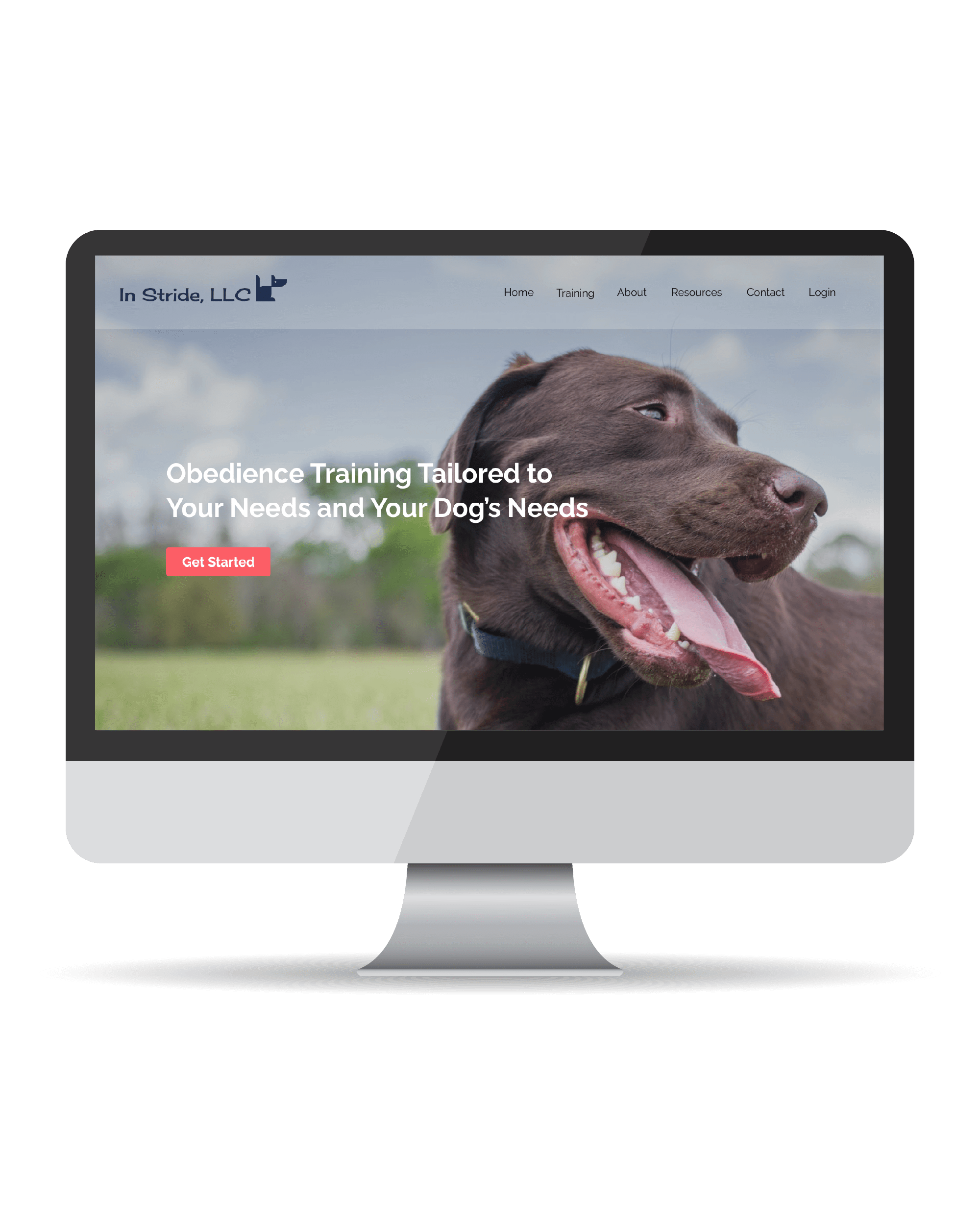
In Stride is a new Seattle based obedience training business that provides a custom approach to dog training.
The Challenge
As a newly formed business, In Stride needed a first website built quickly, while not compromising functionality. They also required online booking, support with implementation, and finding a solution for their client management.
The Solution
Design a website that holds all the necessary information for prospective clients, represents the company values, and makes the experience easy and informative for users. Research and identify a client management software solution and oversee setup. To minimize cost and time to launch, implement design using a website builder already purchased by the client.
My Role: UX, UI, Consulting
Tools Used: Figma, Illustrator, Miro, CMS
Design process
Research
Business Research
Competitor Analysis
User Interviews
Affinity Mapping
Define
User Personas
Journey Mapping
Card Sorting
Site Map/User Flow
Design
Sketching
Wire-framing
Usability Test
UI Design
Implement
Iterate Design
CMS Setup
Build & Integrate
Launch Site
Research
At the beginning of this client project, I began by gathering information about the business goals, services, the ideal customers, and competitor analysis. Due to COVID-19, this project was done virtually utilizing Zoom and other cloud platforms. Below are the steps that were taken through the discovery phase.
Business and Competitor Analysis
To kick off the discovery phase, I first sat down with the client in a series of interviews and onboarding meetings. The output for this phase was identifying and understanding the business goals, services, client’s needs, pain points, and expectations. To better understand the market and gain insights, I then completed a preliminary competitor analysis of businesses in the greater Seattle area offering similar services. The competitive analysis also referred to as benchmarking, gave me a line of minimum features and services offered to help guide in my design.
User Interviews
To gain user insights I conducted a series of 15-20 minute interviews with 5 dog owners from age groups between 22-40 yrs who had previously engaged in obedience training with their dog. The questions were based on experience, decisions, and pain points during research.
Question Examples:
- Can you tell me about your most recent experience researching dog training online?
- How much do you know about obedience training? What information would you need to be present to feel informed as a potential client?
- Can you describe how you would go about booking a dog training service?
- Walk me through your approach in researching dog trainers, describe the key factors in your decision making.
- Can you tell me about your most memorable experience with selecting a trainer for your family?
- What was the hardest or most frustrating part of your experience with finding the right dog trainer?
- Could you describe the ideal booking experience?
key findings
Knowledgable
Participants wanted to clearly see that dog trainers were knowledgable, experienced and certified.
Easy Online Booking
Participants preferred an online booking and the ability to schedule online with options to log in for recurring sessions.
Accessible & Approachable
Participants were more likely to engage with trainers whose sites were easy to navigate and friendly.
Service Variety
Participants were more likely to select a business that offered a variety of training options.
Flexibility
Participants preferred small group or one-on-one training that had flexible hours to fit their busy schedules.
define
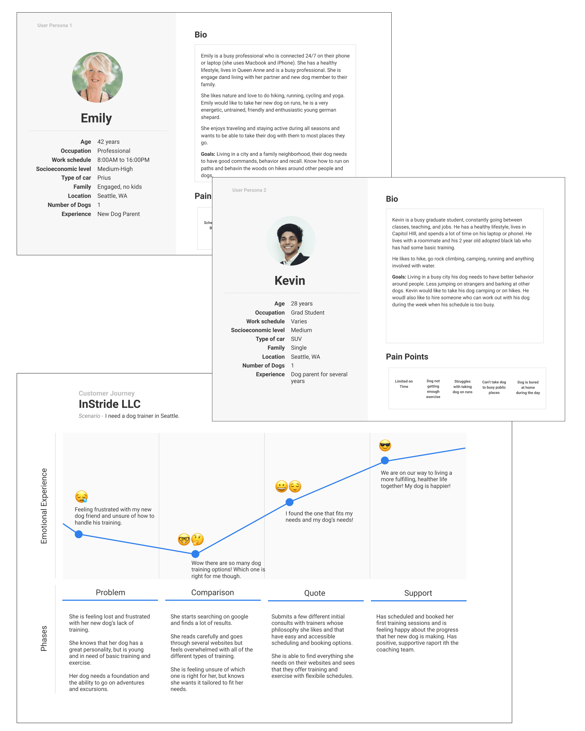
Personas & Journey Mapping
After completing the research and analysis, I began to define the problems in more clear context. To do this I created User Personas and a Journey Maps, informed by my previous user research. This allowed me to better understand the broader influences in a user’s life. This helped me to gain more insights and to help me better visualize what the users’ goals were, motivations for engaging with my client, potential pain points, and tasks they wanted to achieve.
Personas and Journey maps are great tools for understanding users better and driving a human rather than a technical view of a project. They provide a proxy for the user during design.
information architecture
Methodology
Once I captured a clear understanding of user needs and pain points, it was time to generate different potential solutions. Before diving into the design it was first necessary to create a meaningful structure for the website.
Card Sort
To achieve this part, I conducted a card sort, recruiting 10 users for an open card sort online using Optimal Workshop. I started with the card sorting method to categorize the content of the website in an understandable way for users.
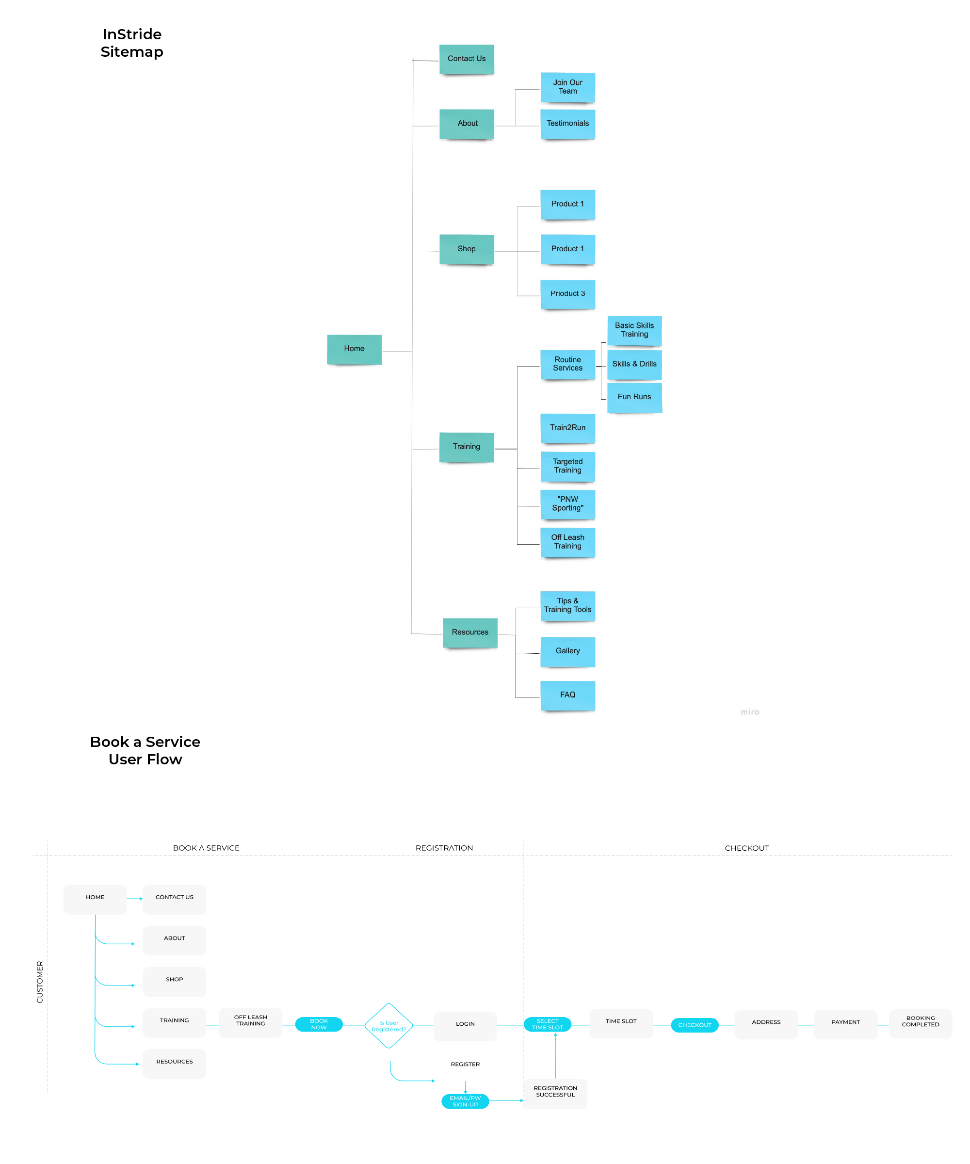
Site Map and User Flows
Based on card sorting data I was able to create an effective site map that would allow users to easily navigate the site. Next, to understand how the users would interact with the site and perform tasks, I created user flows.
Design
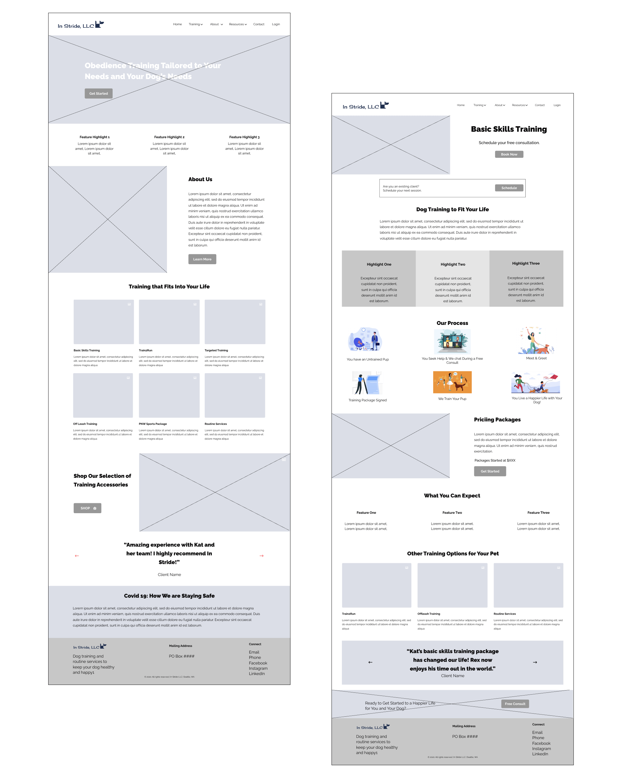
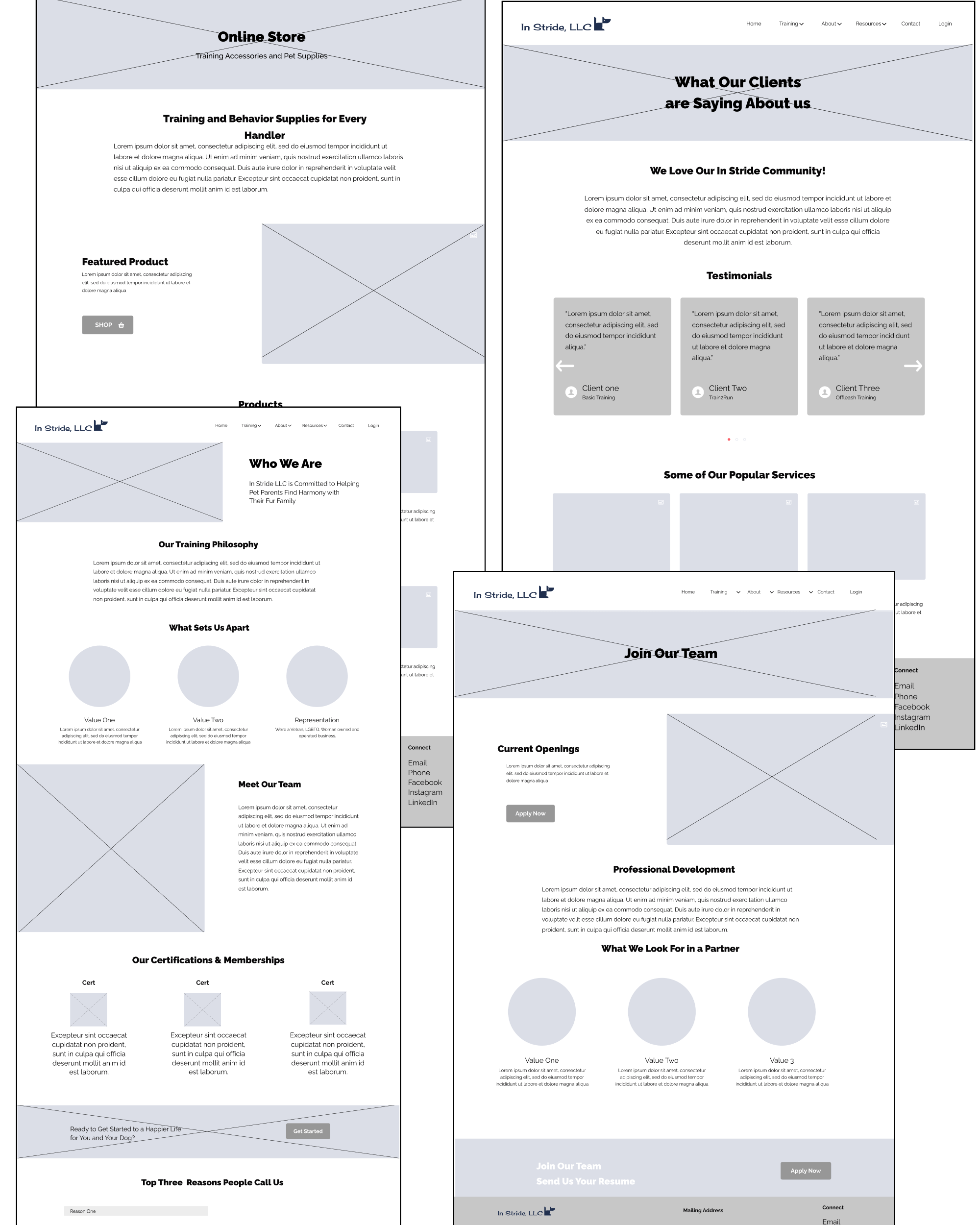
After sketching out the basic structure of various pages of the site design, I began building out wireframes in Figma. I created a quick low fidelity prototype for usability testing and client review.
usability
Over the course of a week I conducted usability testing with 5 individuals that fit my user personas. Due to timing and Covid19, usability testing was done virtually over Zoom. The objectives of the test were to see:
- How easily users were able to locate service pages
- How easily users are able to add a product to their cart
- How users navigated the site
- What their overall experience feels like
- What pain points exist and improvements need to be made
Participants
Tasks Per Participant
%
Task Completion Rate
Layout Feedback:
- Feel approachable/digestible at first
- Content and images feel balanced
- Layout of information makes sense
Information Feedback:
- Important info is easy to find
- Clear understanding of services offered
- Unclear what highlights are for
Usability Feedback:
- Easy to navigate
- Navigation menu makes sense
- Service names can be unclear
ui design
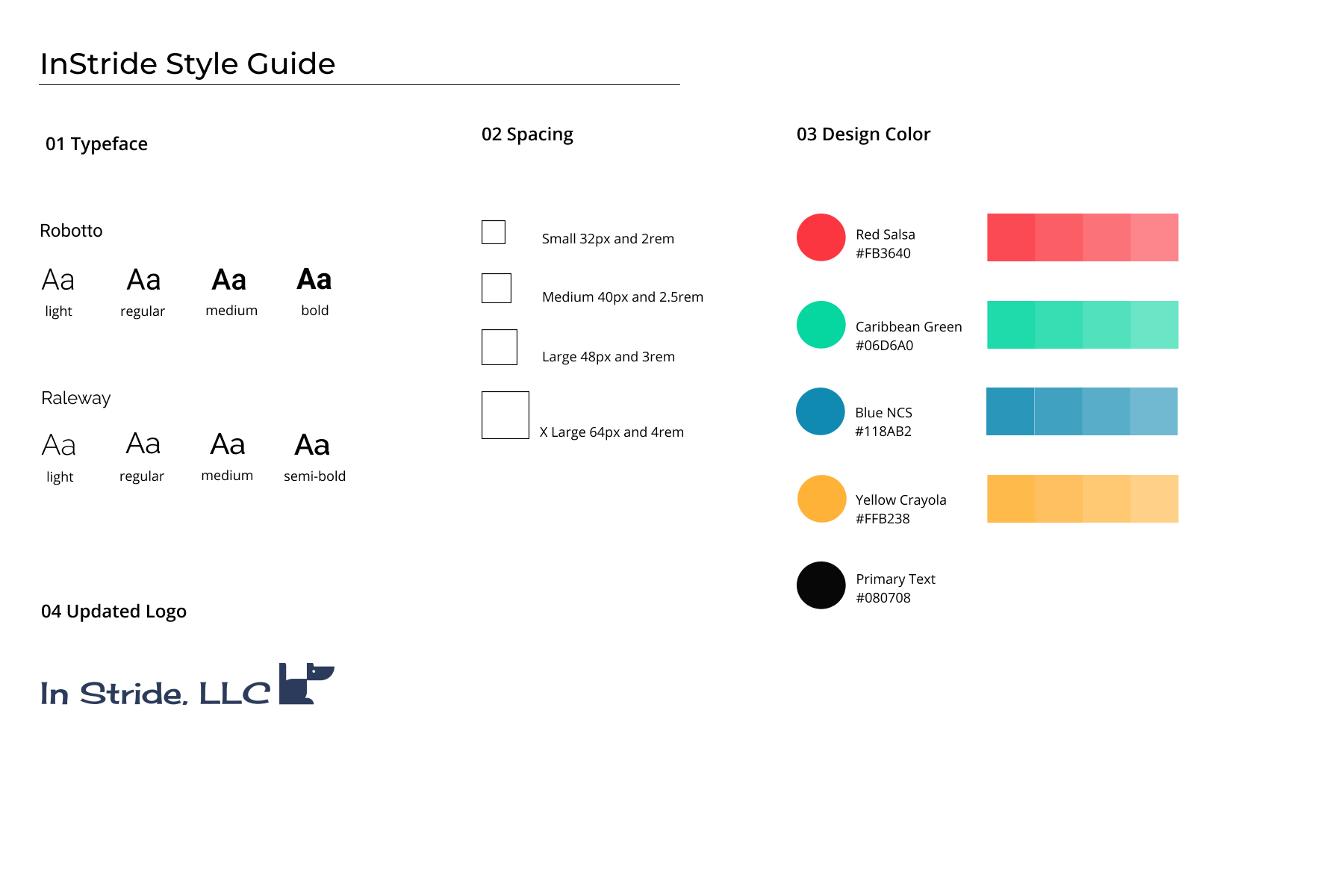
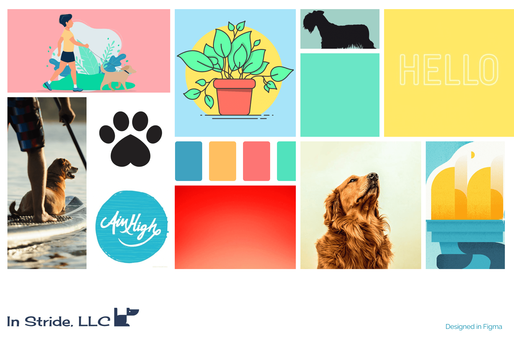
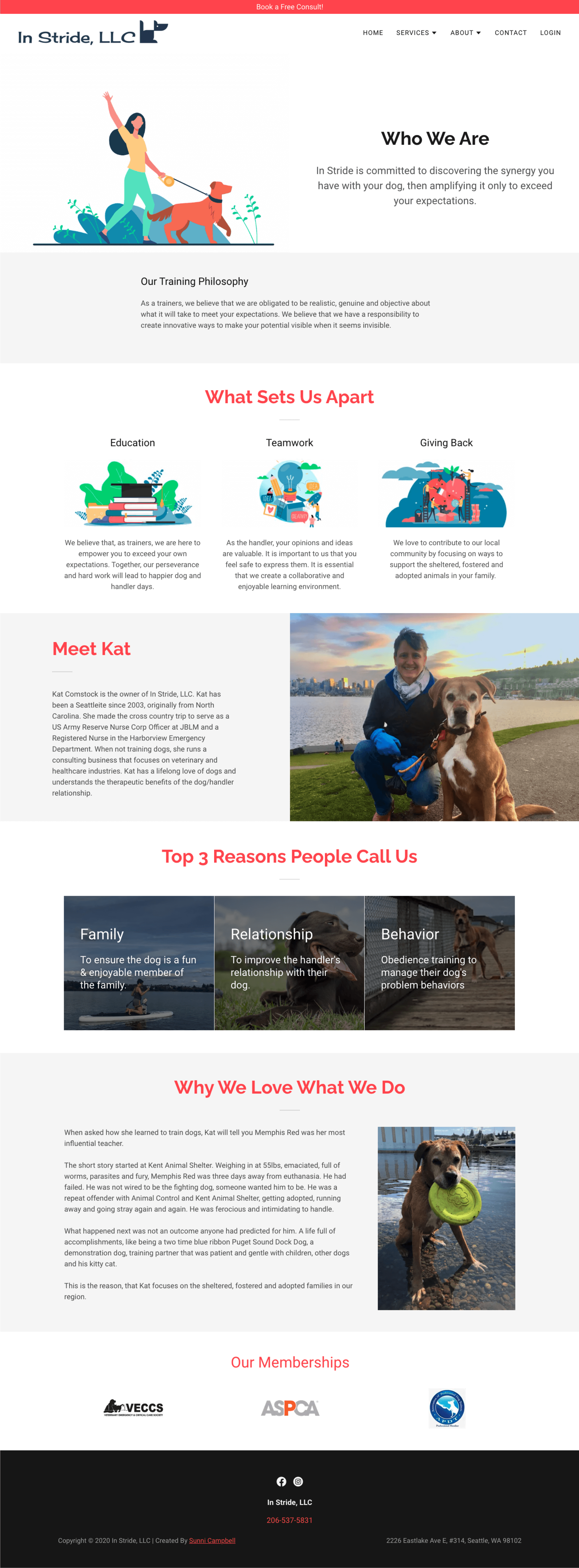
Once I had a better understanding of how users were interacting with the site design, I started to work through the visual design elements. I began by creating a style guide and mood board. It was important to the client that her website reflected her values, her energetic personality and approachability. To accomplish this, I sourced illustrations and used Adobe Illustrator to customize and fit the brand style. I used a brighter palette that pulled in southwest color tones and would inform the brand’s new look and aesthetic.
Style Guide
Mood Board
Illustrations
Hi-Fidelity MOckups


implement
With the final UI design in place and revisions made after a final review with the stakeholder, it was time to implement. Utilizing my background in digital marketing and prior years of website management, I jumped in and helped bring the In Stride website design to life using a website builder that my client had already invested in.
This is also where my background in consulting became useful, as I had previous experience with client management software and building websites using common CMS platforms such as Squarespace, WordPress, and Shopify.
Challenge
Implement the site design using a website builder, achieve consistent customer interactions by integrating workflows within client management software, and integrate with the website.
Goals
Launch website and build an online booking workflow. Acquire more leads through online free consult sign-ups. Take payments online and manage client documents & communication.
Solution
Website Builder + HoneyBook, a platform that helps entrepreneurs organize often-painful business tasks like booking and scheduling, payments, contracts and track their data.

