modern aisles
website redesign, rebrand
my role: ux designer
Overview
The Challenge
Modern Aisles was expanding their business and updating their service and product offerings. They wanted to launch with a rebranded look and feel, migrate to a new CMS, and integrate automated workflows for online booking.
The Solution
A full redesign of the Modern Aisles website with updated information architecture in alignment with new services and product options. Design new branding, build and launch new website redesign on WordPress ensuring integration with customer management software and an online booking solution.
Tools Used: Figma, Illustrator, Miro, WordPress
Design Process
Research
Business Research
Competitor Analysis
User Interviews
Affinity Mapping
Define
User Personas
Journey Mapping
Card Sort
Site Map
Design
Wire-framing
Usability Test
UI Design
Implement
CMS Setup
Build & Integrate
Launch Site
REsearch
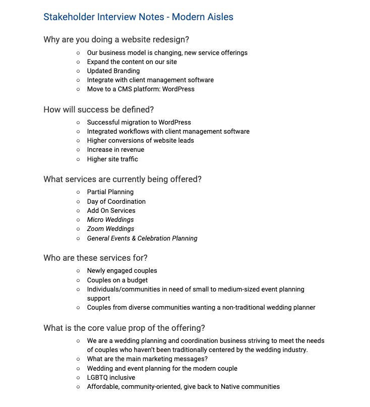
The research phase of this project consisted of stakeholder interviews, competitive analysis, survey and user interviews. To kick off the research phase of this project I began by gathering background information and holding stakeholder interviews to identify the goals, constraints and primary business needs for this project. Below is a sample of the intake questionnaire and main project goals identified.
Project Goals
Updated Information Architecture
Modern Aisles is expanding their services and products
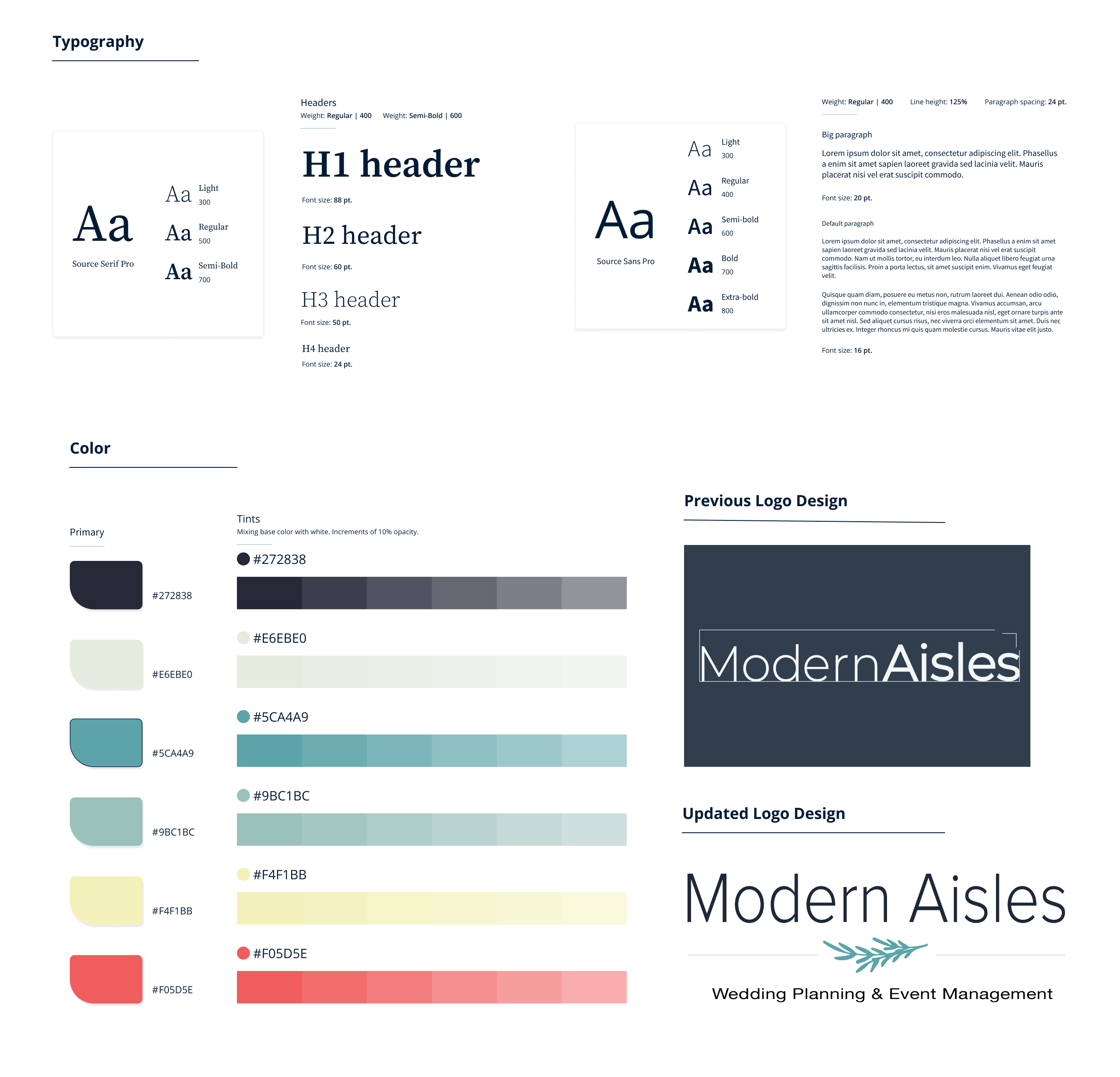
New Branding
An updated logo and branding design.
Automated Workflows
As the business expands, Modern Aisles would like to integrate client management software within website workflows and improve the online booking experience.
Migrate to CMS
Redesign the website and migrate to WordPress.
Increase the Number of Visits and Time on Site
Competitive analysis
To gain inspiration and better understand industry best practices, I conducted an in-depth competitive analysis in order to identify industry standards for a website redesign. I began by looking at the website of several direct competitors and their services, website features, online experience, strength and weaknesses.
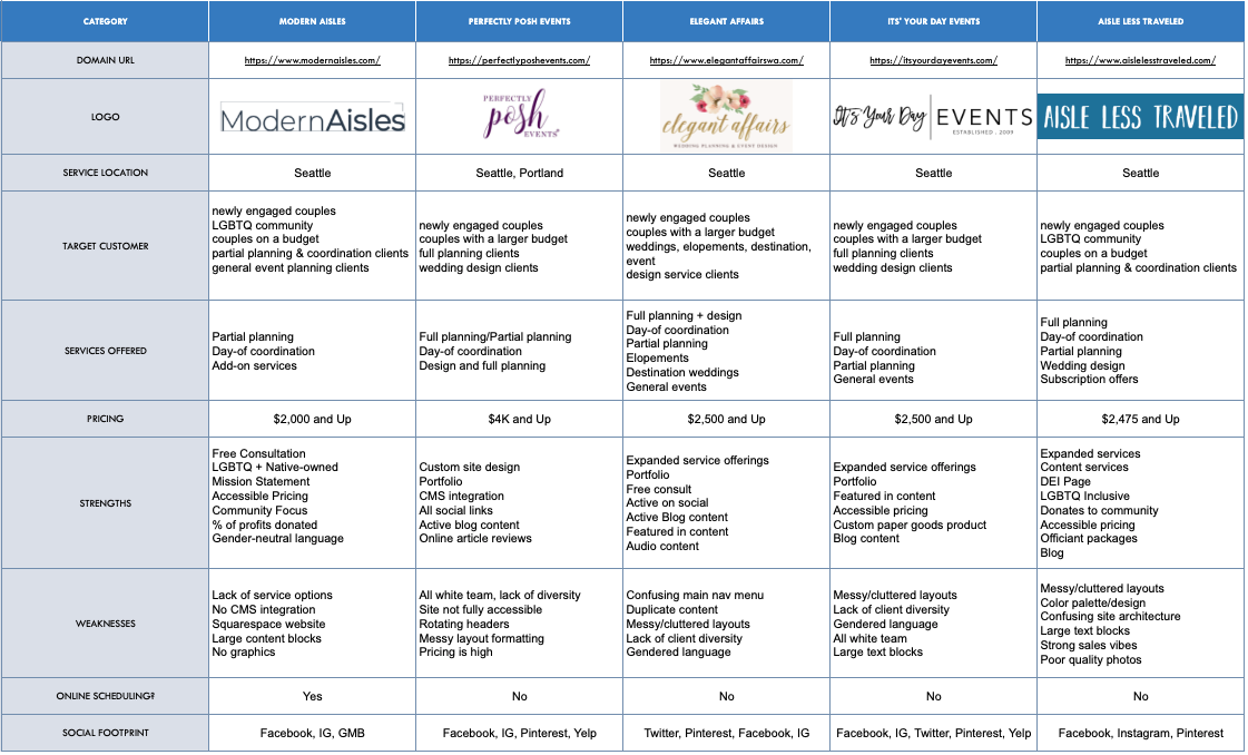
Competitive analysis
Key Insights
Expanded Service Offerings
Diverse service offerings include design, full planning, elopements, destination and general event planning.
Online Booking/CMS
The majority of competitors had no online scheduling tool present or integration with client management software.
Content
All competitors surveyed in the analysis had active blog content, an updated portfolio with prior wedding case studies and active social media feeds.
Target Audience
The majority of sites are marketing to predominately traditional wedding couples, not using inclusive language or exemplifying diverse teams and/or couples in portfolios.
user research
To better understand the customers’ thoughts, needs, and pain points, I conducted an online survey and interviewed five people about their experience searching for a wedding planner/coordinator. Interviews were conducted via Zoom and I used Optimal Workshop to conduct the online survey that was completed by 20 individuals. Insights gathered were then arranged in an affinity map.
Example Questions
- How long were you engaged before you began searching for a wedding planner/coordinator?
- What are the main qualities and characteristics that you look for in a wedding planner/coordinator?
- Tell me about the last time that you researched an event/wedding planner and booked a consultation.
- What did you find frustrating about the experience? What did you enjoy?
- What features are most important to you when deciding on an event/wedding planner?
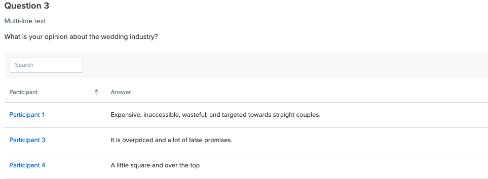
Sample Responses
Analysis
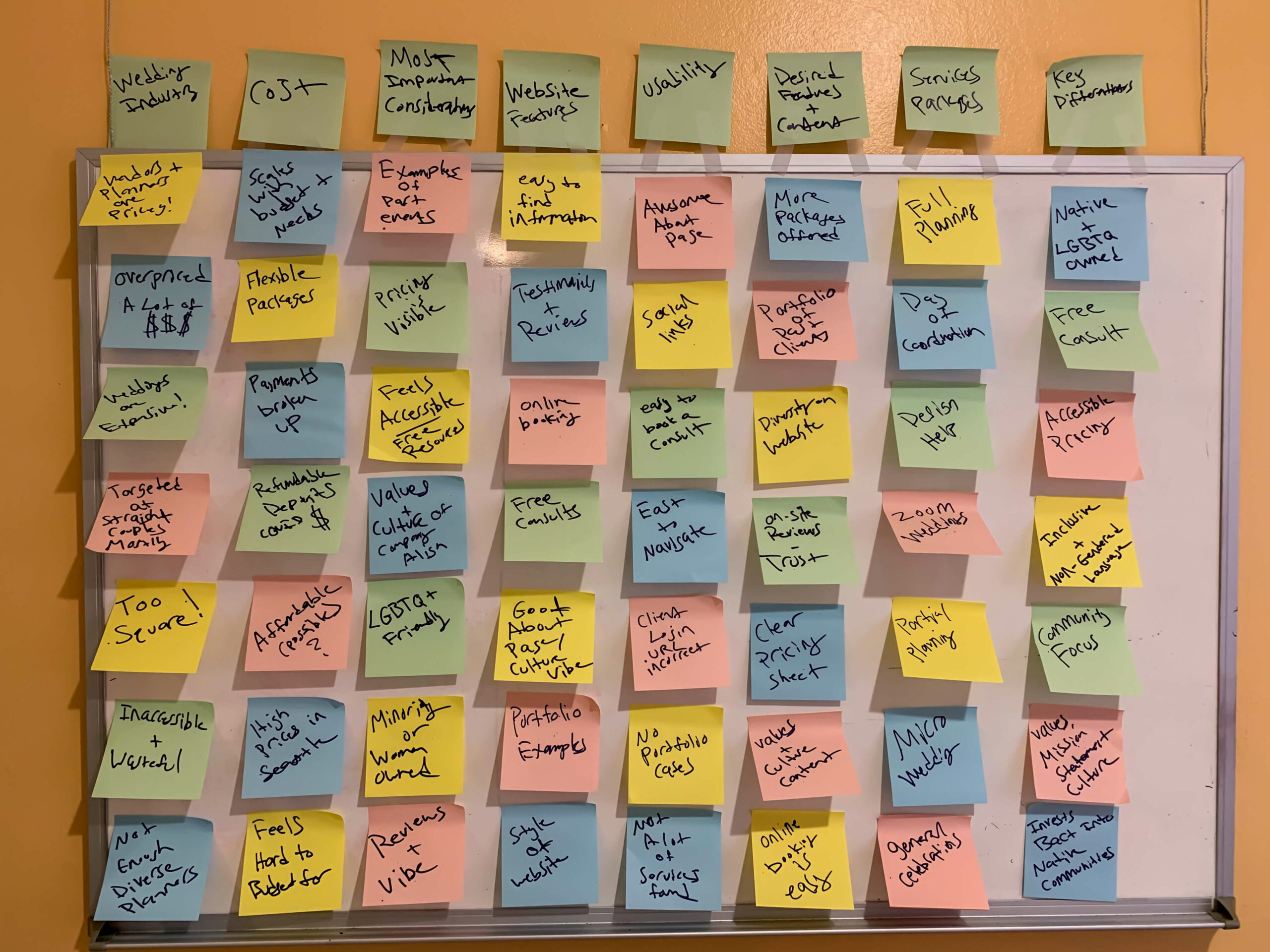
Affinity Mapping
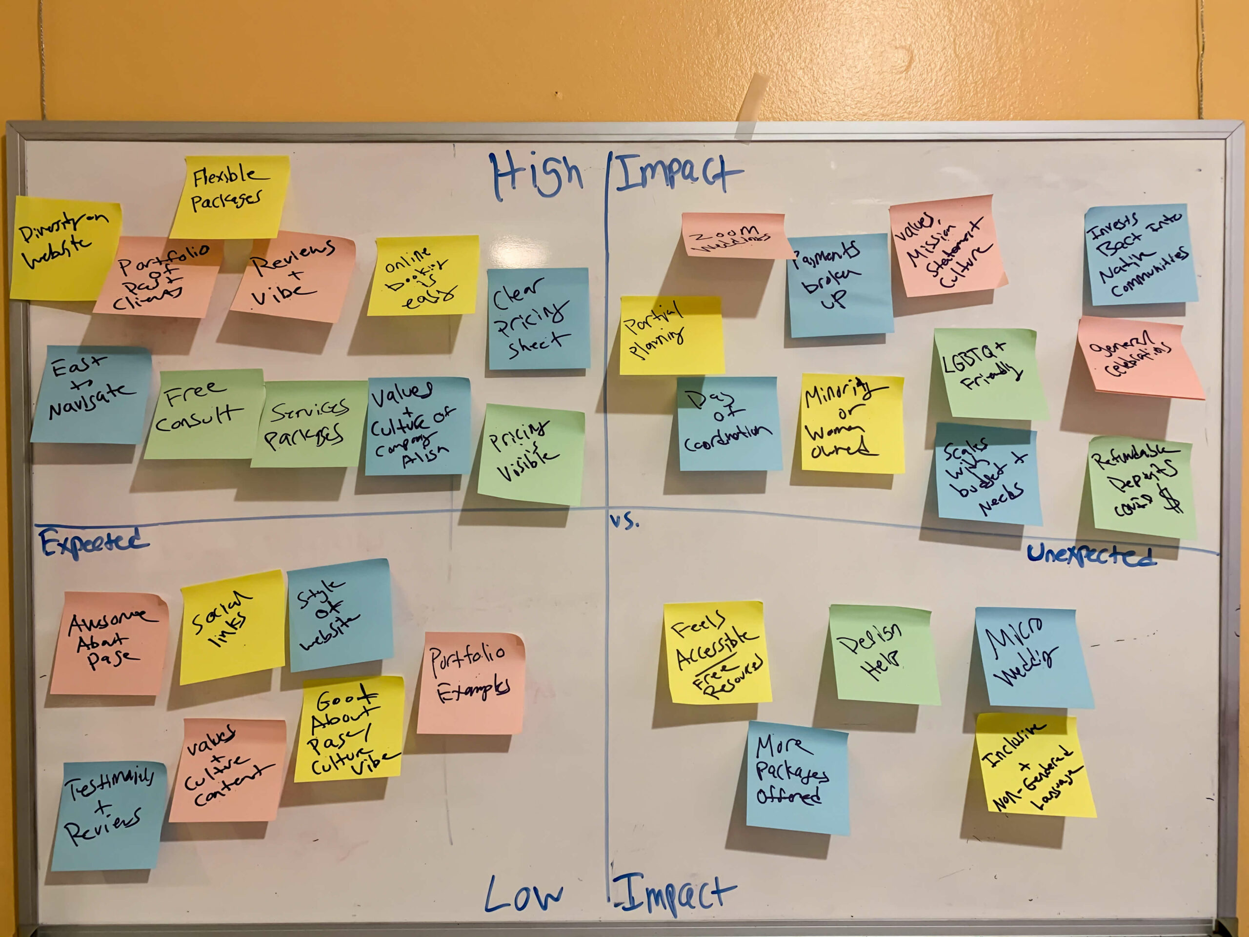
Activities towards forming the solution included affinity mapping, problem statement and feature prioritization. All of the information from the research phase was collected and an affinity diagram was made to align with stakeholder’s needs. The affinity diagram below includes inputs from stakeholder interviews, user interviews and survey data.
Mental Model Technique
I developed potential features using a ‘Mental Model’ technique and mapped out their possible values using a Feature Prioritisation method, including High vs Low Impact
Affinity Map
key findings
Values Fit
Online Experience
Inclusive & Accessible
Flexible Cost
Experience & Trust
define
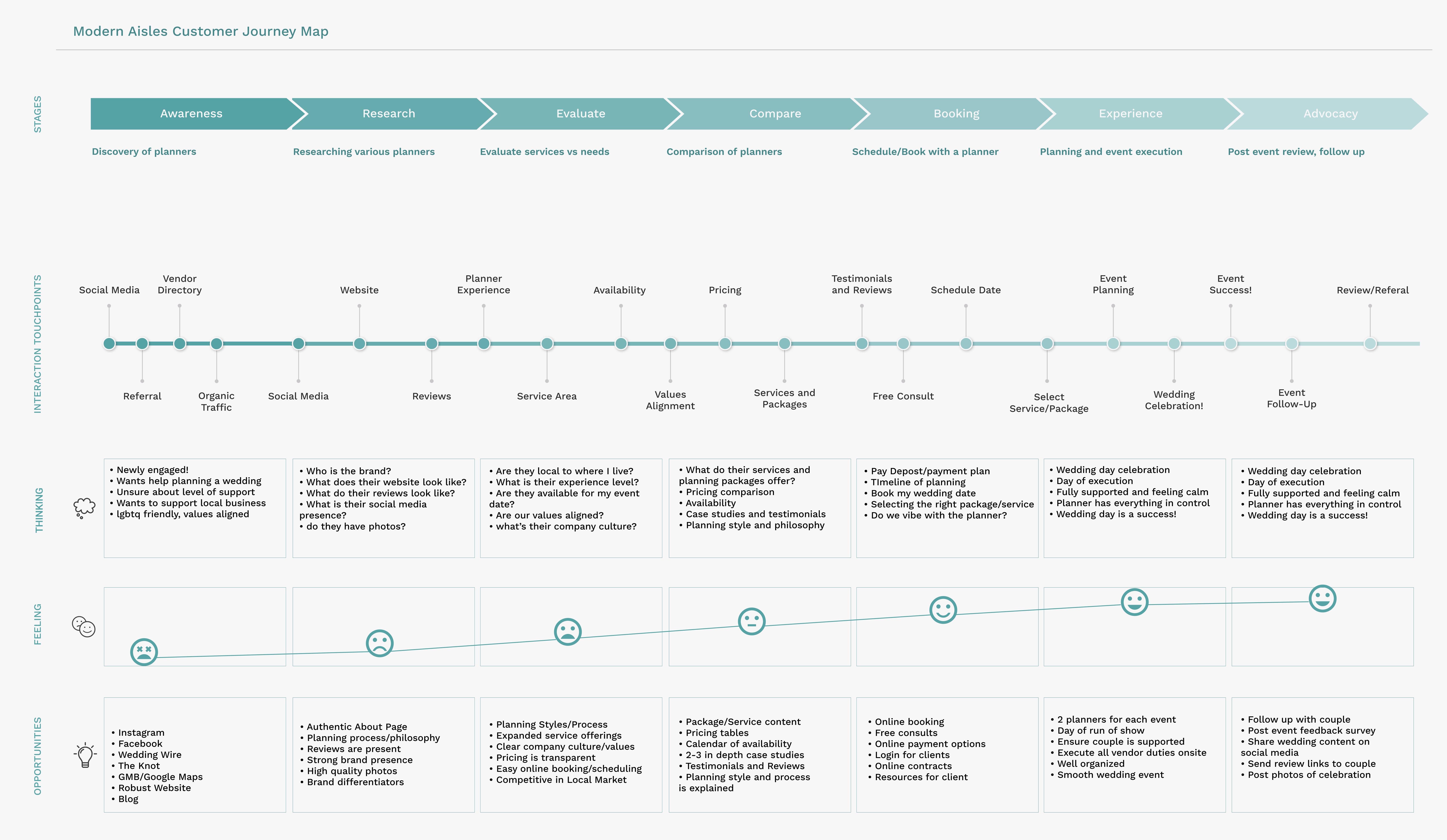
Personas & Journey Mapping
I developed three personas based on what I knew of the target users and their needs and pain points. The three personas reflect different types of couples who are representative of potential users of the website.
In order to visualize the current experience from the user’s perspective, I created a series of user journey maps to illustrate potential scenarios where a user might interact with the Modern Aisles brand. Including the process of first discovery, touch-points, booking flow, decision considerations and experience.
Information Architecture
With a user-centric approach, I began to define and test the IA for a reimagined Modern Aisles website.
User Testing
By conducting 5 user tests to understand how users interacted with the current website, I identified potential problems with the current navigation and booking flow.
Card Sort
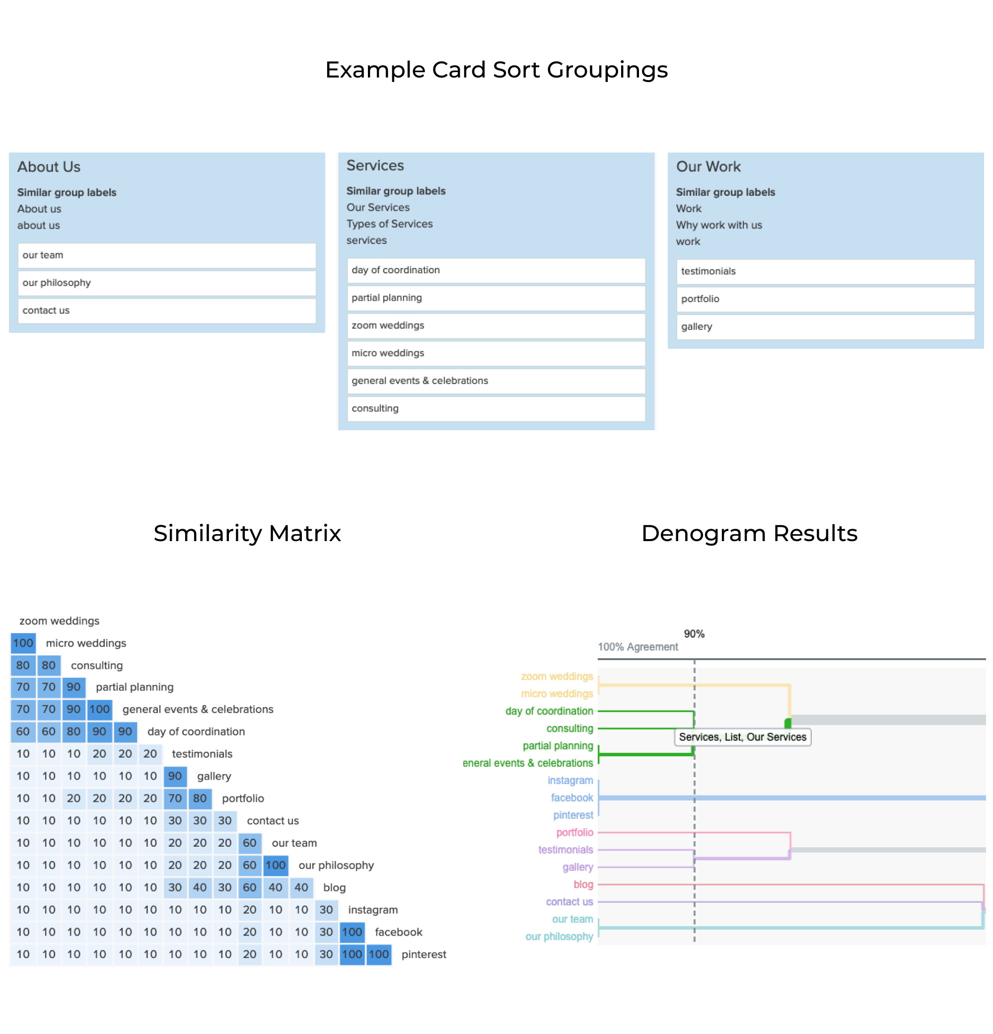
Informed how we could re-group the current website IA and make it more cohesive with new services and content was key to forming the new navigation menu.
Analysis
During user testing, 5/5 participants successfully located and booked an online appointment signaling that the current booking flow was easily understood by users. Card sorting data revealed that 90% of participants preferred to group new and existing packages together using “services” in the menu.
site map & user flows
Before diving into the design I sketched out site maps and user flows based on the data and analysis from earlier research. I then created the deliverables in Miro.
Site Map
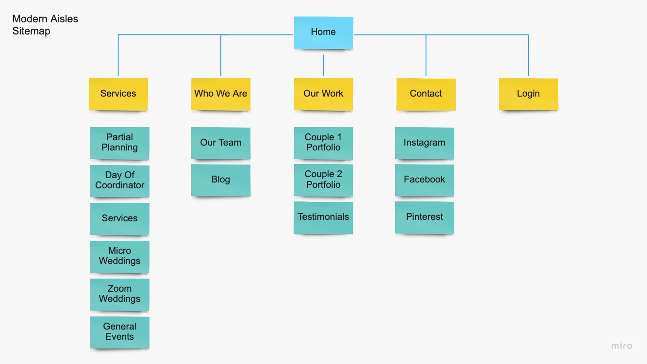
Taking the card sort and user testing data into consideration, I created an effective site map that would allow users to easily navigate the site reflective of the new service offerings and content of the Modern Aisle site redesign.
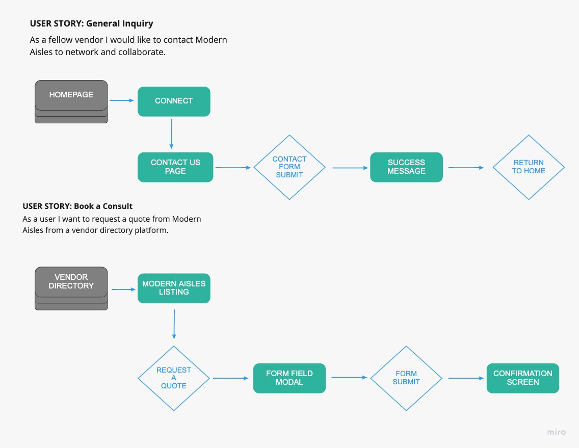
To understand how the users would interact with the site and perform tasks, I created user flows for Booking a free consult on the website, submitting a general inquiry via a contact form, and scheduling a consult via a wedding planner directory.
design
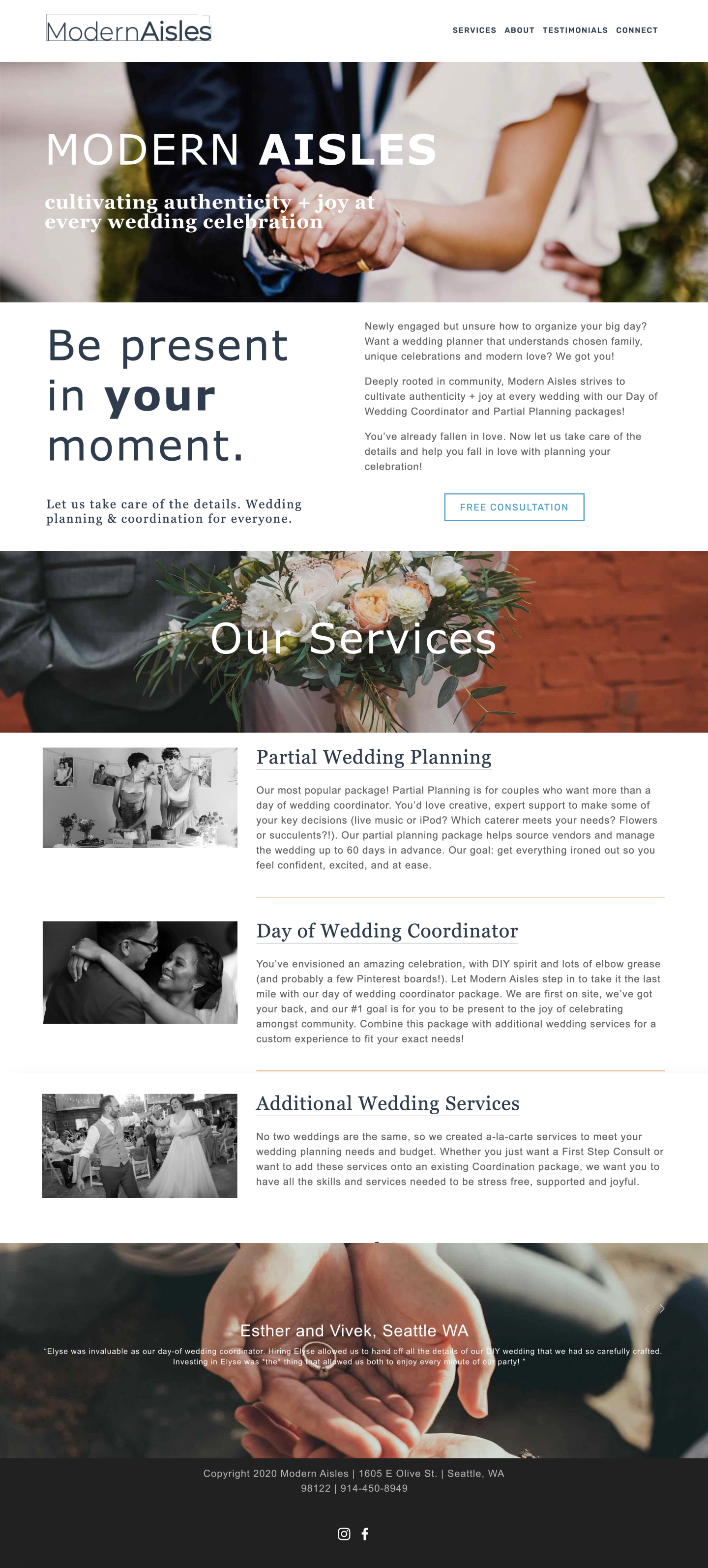
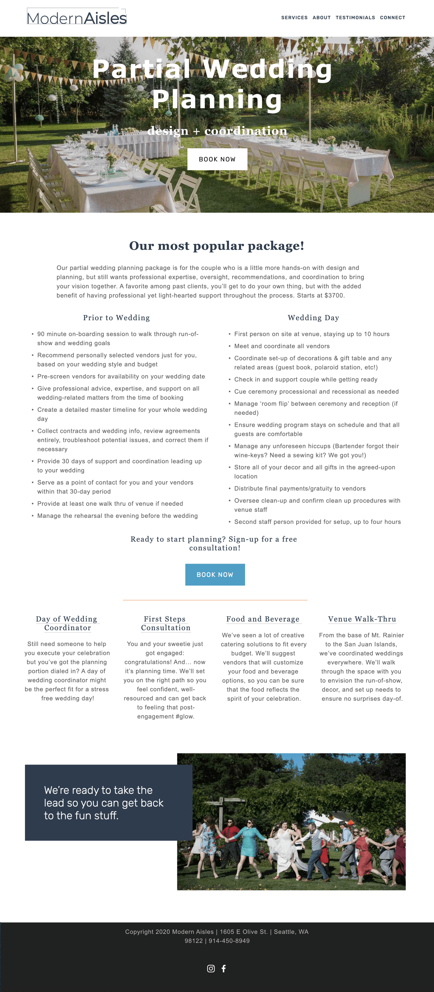
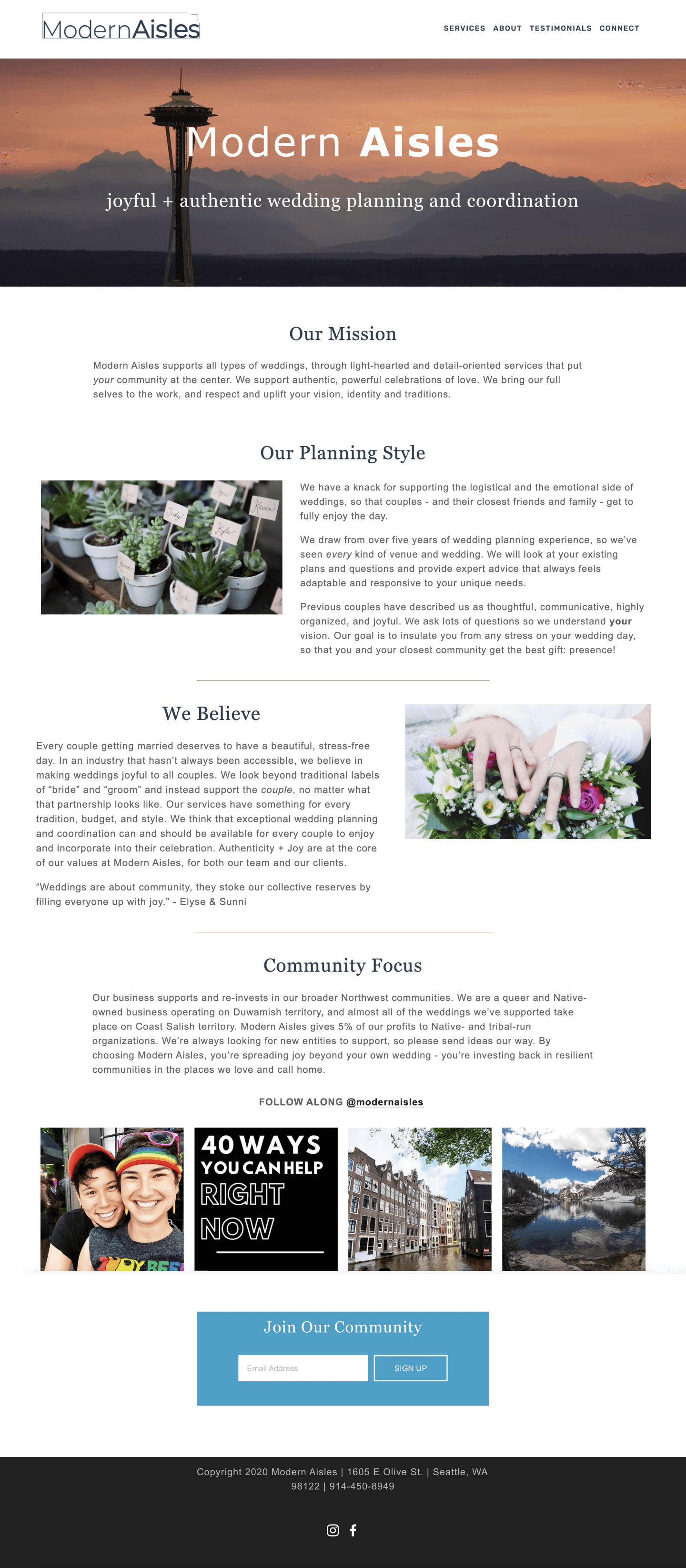
Prior to this redesign project, the Modern Aisles site was built using a simple drag and drop website builder. It utilized limited stock photography, no graphic design aspects or branded color palette and lacked custom functionality and design as seen in the below screenshots.
Style Guide
