nin
Program Project: Climate justice app
role: ux designer
Overview
Nin is an app that empowers individuals to learn, connect and organize for climate change by participating in collective, civic and political activism.
The Problem
With questions of personal, societal and governmental responsibility in the air, the American sentiment on climate change today is largely one of disillusionment, overwhelm, and avoidance.
The Goal
Find a solution to help individuals in their local communities exercise their political power and adapt their behaviors in accordance with climate change principles.
My Role: Research, Ideation, Concept Testing, Information Architecture, User Flows, Wireframes, Usability Testing, UI Design, Final Prototype
Tools Used: Figma, Illustrator, Miro, WordPress
Design Process
Empathize
Primary Research
User Interviews
Secondary Research
Define
User Personas
Journey Mapping
Insight Analysis
Ideate
How Might We
Rapid Ideation
Concept Testing
Prototype
Site Maps
User Flows
Wireframes
Test
Usability Test
UI Design
Final Prototype
Empathize
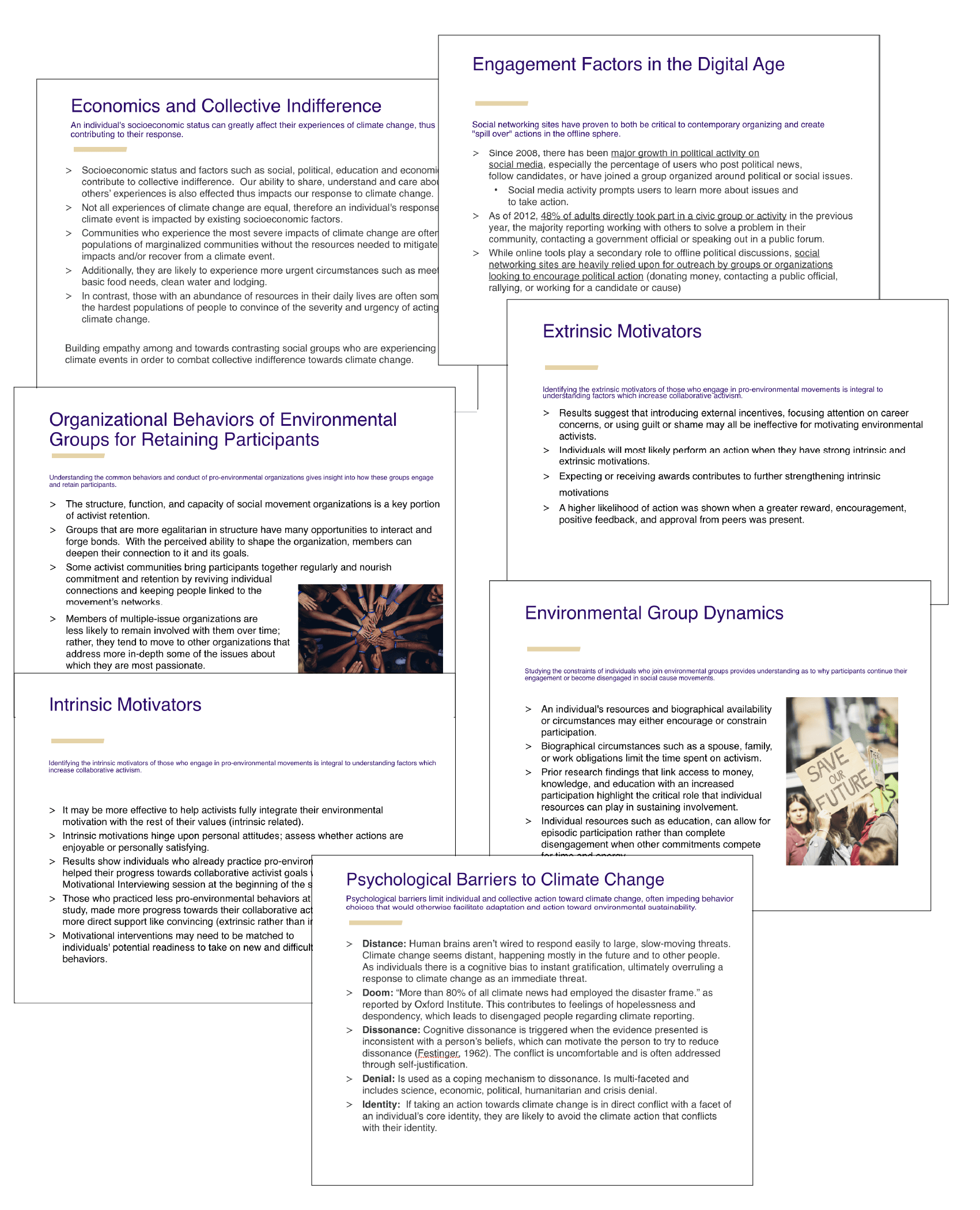
Climate change is transforming our region, and its impacts have only become more apparent. Among individuals who recognize the scientific consensus and have no doubts about the reality of climate change, there is a large disparity of attitudes about getting involved in climate justice activities. We needed a better understanding of the problems and issues that individuals faced when engaging with climate change activities. To accomplish this, we began by conducting primary and secondary research and analysis.
Primary Research: Our group chose to conduct audience interviews for our primary research method to gather information on user’s feelings, motivations, behaviors and routines around climate change. We started our research phase with one-on-one interviews lasting between 45 minutes to 1.5 hours. Over the span of two weeks, our team interviewed 15 individuals ranging in age from early 20’s to over 70.
15
Interview Participants
20
Questions Per Participant
300
Individual Data Points
Secondary Research: We focused our secondary research on four main areas of analysis, topics included: the culture of political tribalism, civic engagement, the psychology of barriers, and motivation to action. Each group member took one of the four areas of analysis to research.
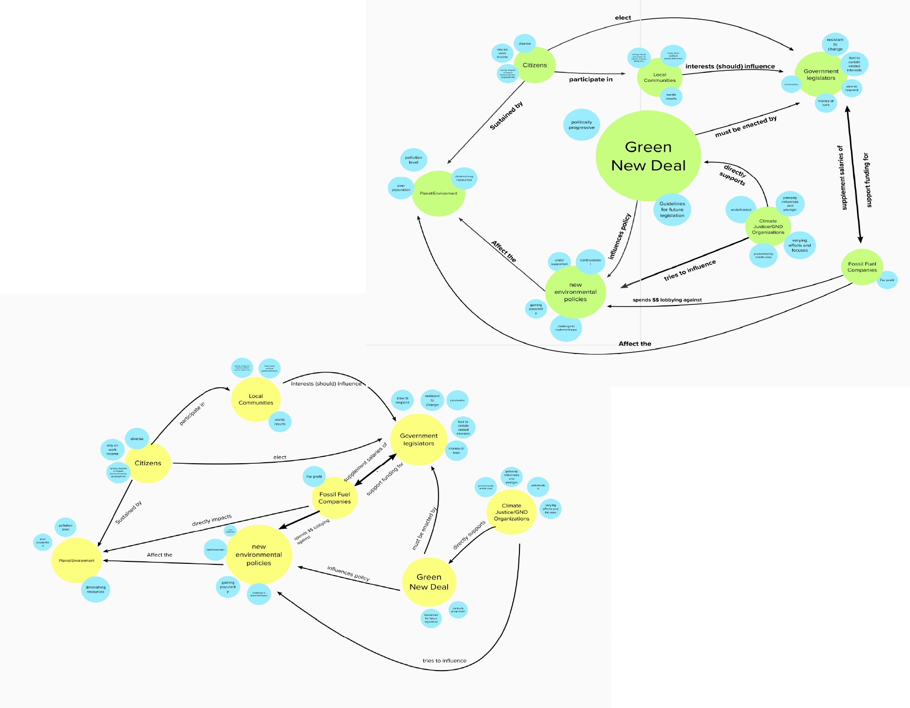
Analysis: Utilizing a shared research Notebook, virtual sticky notes, and the platform Mural, our group was able to effectively organize and analyze our data. Using the method of affinity mapping to uncover themes from participant interviews, we came to understand that individuals had feelings of overwhelm about the complexity of climate change and uncertainty of where or how to proceed with civic engagement. This also backed up what we had initially uncovered with our user interviews.
Research Findings
Key Elements
Even though significant percentages of surveyed individuals expressed their interest and willingness to engage in the movement, there are many barriers to overcome in order to mobilize citizens to “active and sustained participation,” mostly psychological in nature.
Overwhelm
People have feelings of overwhelm about the topic of climate change, resulting in alienation, defensive avoidance or apathy.
Misinformed
Misunderstanding about the potential for devastating impacts on their own lives, local communities and other parts of the world.
Motivation
Individuals recognize the scientific consensus and have no doubts about the reality of climate change, however there is a clear lack of intrinsic and extrinsic motivators toward action.
define
Personas & Journey Mapping
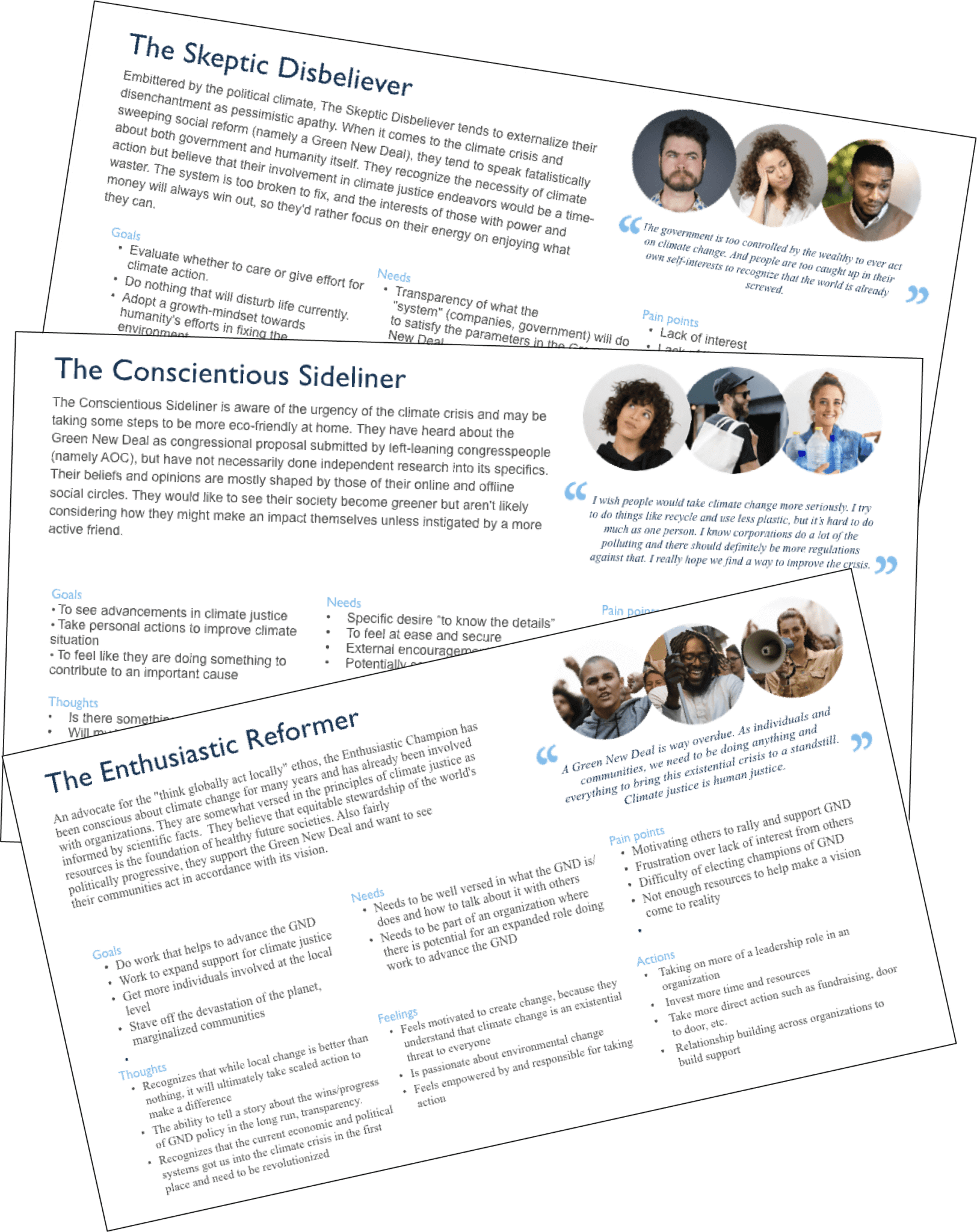
Based on our research findings, we created user personas and journey maps to help provide us with a better understanding of our users. This step helped us visualize what our users’ goals were, motivations for using the app, pain points, personalities, behavior, and tasks they want to achieve. At this point, we had identified two personas that were to become our target audience.
The Conscientious Sideliner is someone who is aware of the urgency of the climate crisis and might be taking some steps to be more eco-friendly at home like composting or recycling. They are troubled by climate change but are not really sure how else they might begin to help, and feel a general sense of overwhelm.
The Enthusiastic Reformer is an advocate for the “think globally act locally” ethos, they are someone who has been conscious about climate change for many years. They have already been involved with organizations and climate justice is a top concern and feels a deep sense of urgency to act.
ideate
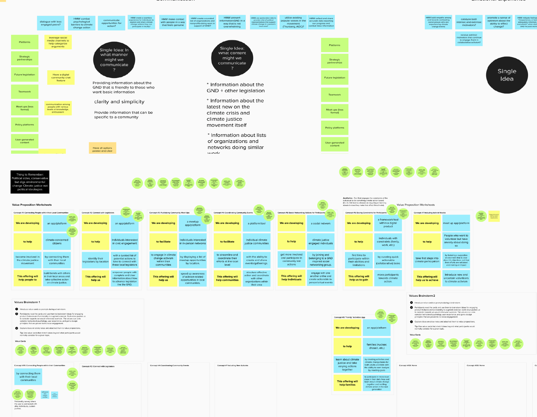
As we developed a better understanding of the problem landscape as identified by our audience, we began coming up with several solutions through the process of rapid ideation. We used comparative matrices to identify potential products and value propositions to define our product goals.
Matrix Brainstorm
Guided by our user journeys and personas we used a matrix brainstorm activity to ask a series of “How Might We” questions.
Value Propositions
Once we had an initial set of product concepts, we organized and narrowed them down to the most viable solutions by running each product idea through a value proposition exercise.
Concept Testing
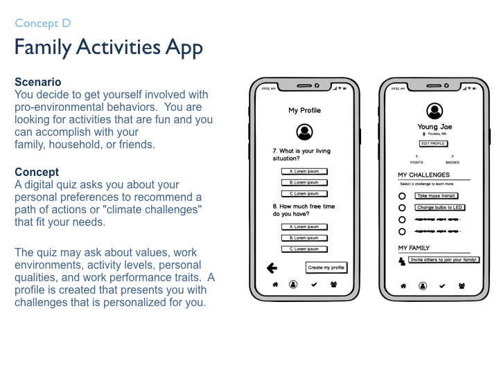
Once we solidified our initial concepts, we tested our four MVP’s, running users through scenarios and concepts to validate which solutions were most likely to solve the user’s problems and to see which concepts and features were most valued.
Primary Research
We conducted 5 rounds of concept testing with different users to collect qualitative feedback.
Post Interview Survey
Following the concept test study, each participant completed a survey
- Gather quantitative data
- Understand which features were the most important to users
- Understand communication and user engagement preferences
- Initial pain points that existed with each concept
key findings
Access to Information
Participants wanted information related to climate change that is easily accessible, clearly laid out and digestible to read.
Individual vs Community
Participants desired the ability to connect with others they already know or to invite members from their communities to join with them.
Measuring Impact
Participants want to know that the actions they take will make an impact and want the functionality to track their progress over time.
Convenience Matters
Participants wanted to engage in actions that are low barrier, easy to complete, and can fit conveniently into their lifestyle.
The Value of Choice
Participants are more likely to engage in actions when choices/activities are presented simply and there is a variety of engagement options.
prototype
Nin translates to “water” in the language of my tribe. Water has always been a healing element, it drives all forms of life, it is connecting, fluid, and powerful.
Nin is an app that empowers individuals to learn, connect, and organize for climate change in their local communities by participating in collective civic and political activism right from the palm of their hands. It enables users to easily take actions like connecting with their local legislator on climate policy, continue to grow their own knowledge around climate change, and track their progress along the way.
When considering my product’s purpose, I wanted to create a solution that people could easily use and integrate into their daily lives. A product that felt accessible regardless of where an individual is at in their individual climate change learning journey.
information architecture
After research and analysis review, I began to think through the information architecture. To help with this part, I recruited 12 users and conducted an open card sort online using Optimal Workshop.
Card Sort
Since I conducted the card sort online, I wasn’t able to gather direct feedback from participants as they completed the sort. This is something that I would like to do for future card sorts, as in person feedback likely would have yielded deeper insights.
Site Map
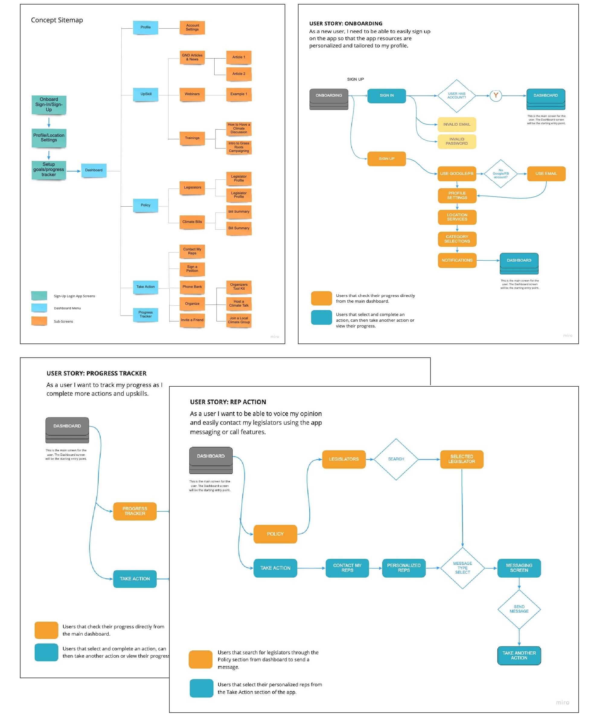
Keeping the card sort results in mind, I developed a site map that would allow for users to navigate the app easily.
User Flows
To test the validity of the site map, I designed 3 user flows for the following interactions to be tested: sign-in, read an article and send a message to a representative.
3 key features
Actions
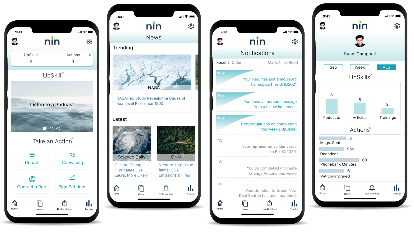
A place in the app where users can take actions such as sending messages to legislators, phone bank, donate, sign petitions and more!
UpSkills
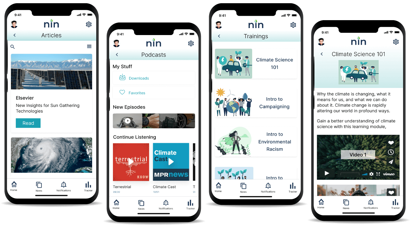
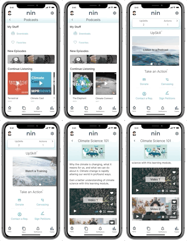
Users can continue to grow their climate change knowledge by completing “UpSkills” in the app such as reading articles, listening to podcasts or watch training modules.
Impact Tracker
Users can track their progress over time and view how many Actions or UpSkills they complete.
WIreframes
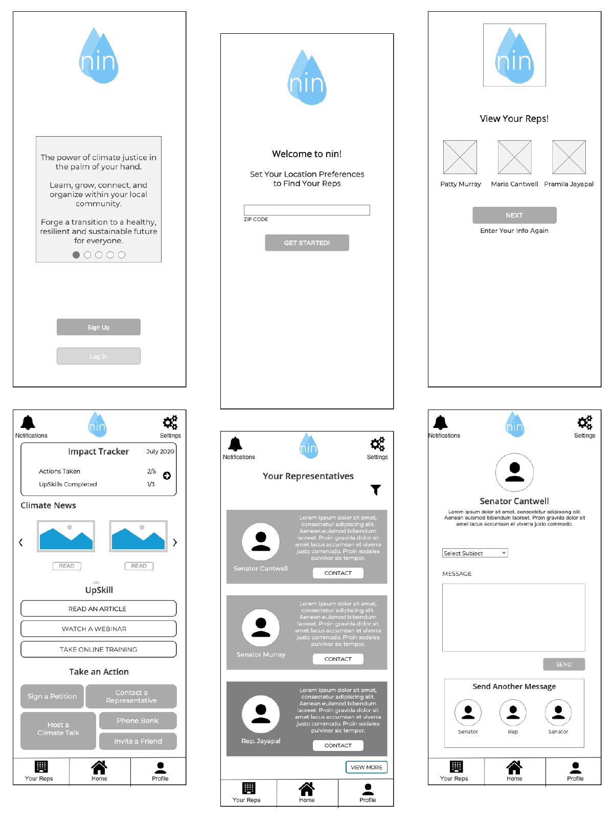
Using a program called Axure I created low-fidelity wireframes based on early design sketches. This allowed me to visually determine how best to present my content based on concept testing feedback and my user’s needs.
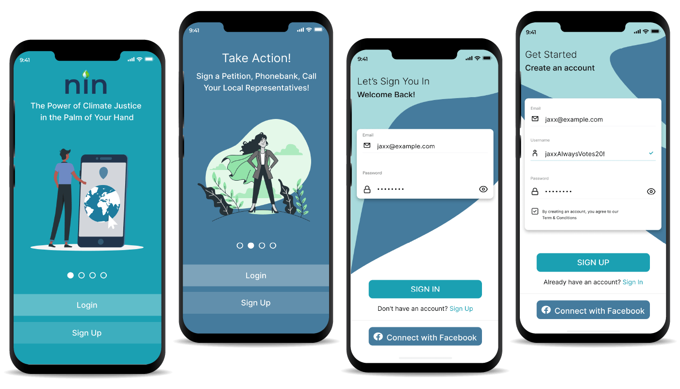
I created an onboarding sequence and sign-in/sign-up flow. I also built out the main home screen of the app, representative profile screens and an articles screen within the UpSkills section of the App.
Wire-framing allowed me to quickly create the first iteration of my app for usability testing, giving users something to physically interact with to test/validate my initial designs.
Test
usability testing
After creating my low-fidelity prototype in Axure, I was able to conduct usability testing with 8 individuals who fit my target personas. Due to Covid, I completed usability testing virtually over the course of two weeks using Zoom. Participants were aged between 22 – 45yrs, 4 males and 4 females. The objective of the test was to see:
- How easily users were able to sign-up
- How easily users are able to send a message to a representative
- How easily users are able to read an article
- How does the overall experience feel like
- What pain points exist and improvements need to be made
User Feedback:
Sign-Up Flow
A shorter signup flow was preferred by over 7 out of 8 participants. I implemented an option to use social media or email to streamline the process in the high-fidelity prototype design.
Rep Profiles
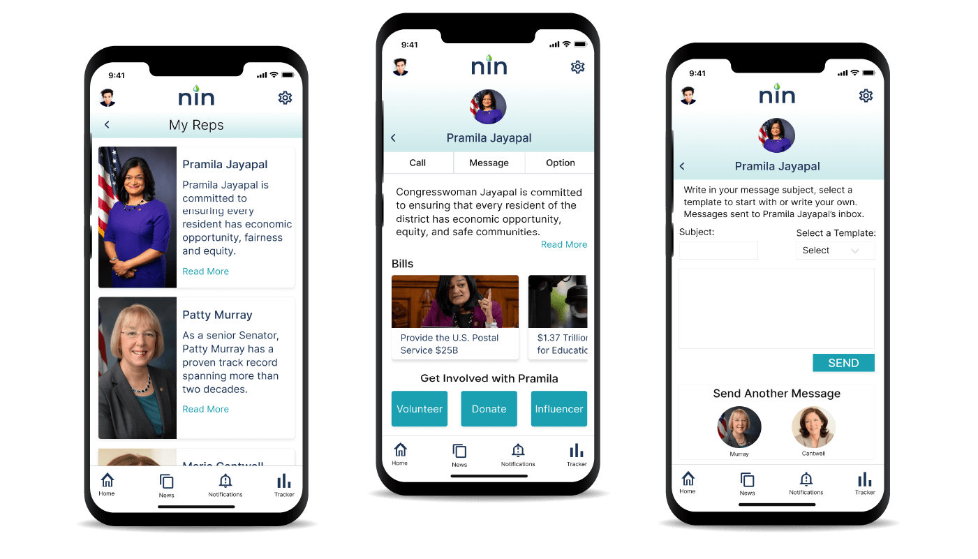
The ‘Get involved’ section on Rep. profiles caused some uncertainty amongst users, it wasn’t clear that the actions were specific to the representative’s campaign. I chose to change the labeling for this section providing more clarity to users in the next prototype.
Dashboard
Participants found the dashboard screen to be cluttered and a little too busy. Taking this into consideration I relocated some of the dashboard elements in the high fidelity prototype to reduce crowding.
Final prototype
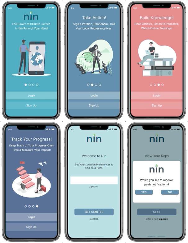
Onboarding sequence
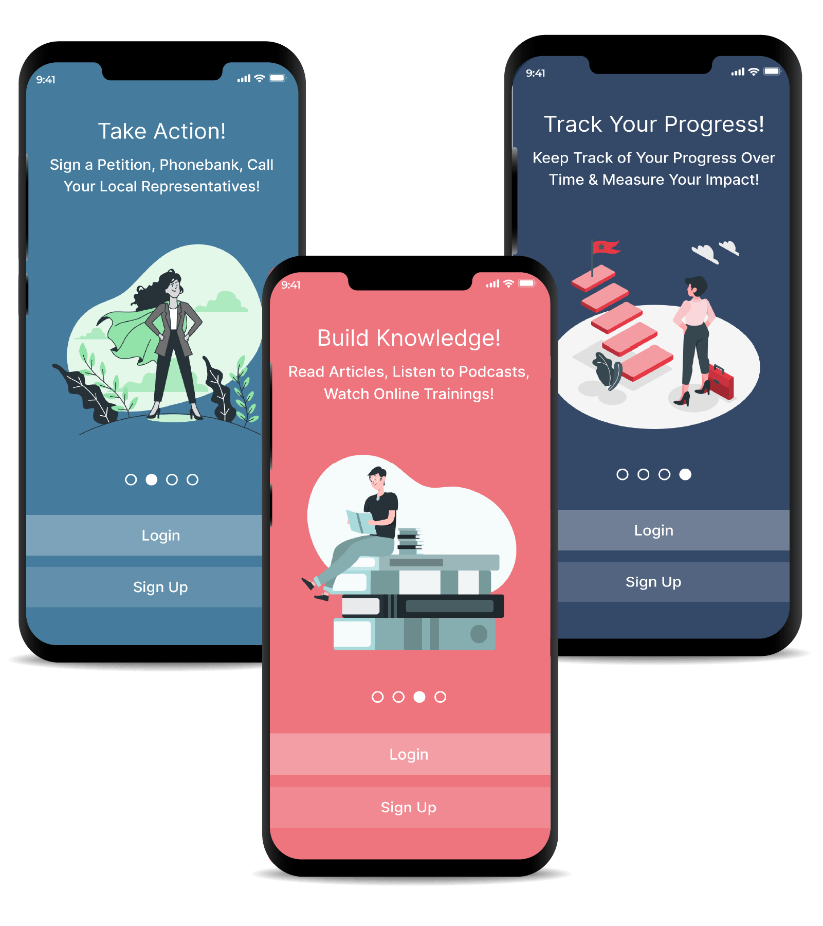
Designed with four palette colors and illustrations sourced from freepik, I used Illustrator to make changes to each graphic, adding elements and colors for a more branded experience. I used illustrations of empowered individuals to connect back to the purpose of the app. The “caped person” for instance, represents a user finding their role in the climate change movement and taking action.
Navigation Bar Screens
A multi-layered background with gradient for the headers to provide some color reminiscent of water. I used the darkest blue color from my palette for the navigation icons throughout the app to match the blue in my logo. There are multiple places where I used drop shadows to give the appearance of floating elements. My main CTA color is the brighter sea green color in my palette.
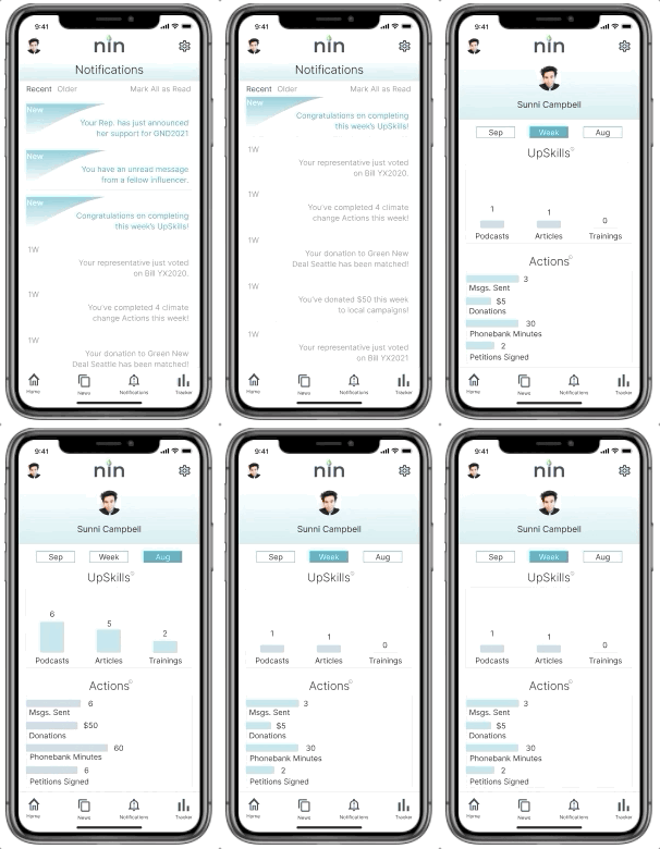
Upskills
I used a mix of illustrations and images throughout the app to make the design a bit more unique and engaging for users. Here are some of the screens that a user can navigate to from the UpSkill section of the app to continue building their climate change knowledge. I chose to use illustrations within the Trainings section of the app to bring out a lighter mood, some playfulness and approachability.
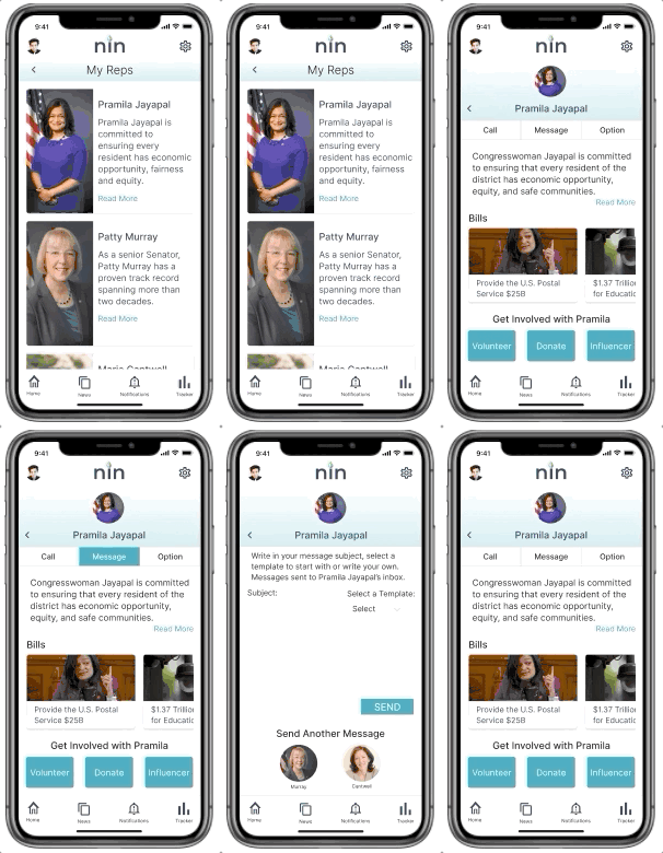
Message a representative
Users will be able to send a message to their local representatives, call their office, and more. I chose to use larger cards for the My Reps screen to show larger images of the individuals and used the green from my palette for the CTAs throughout.
ui design
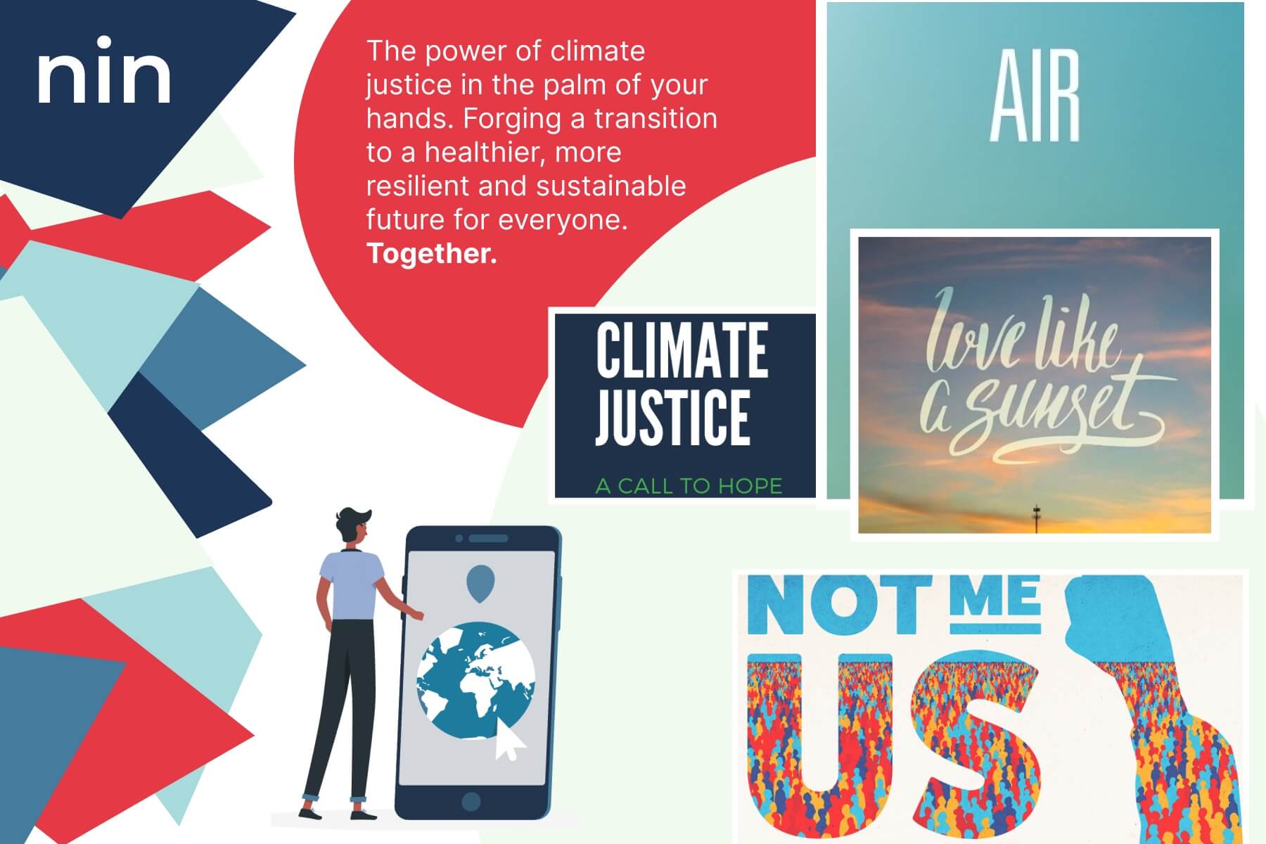
When I started creating the visual elements and branding for a high-fidelity prototype, I knew I wanted my design to convey approachability and empowerment. My visual design was largely influenced by the elements of water and air, tying back into the translation of Nin. With the topic of climate change being a heavy topic emotionally, it was important for me to keep the feeling of the design energetically light.
Logo
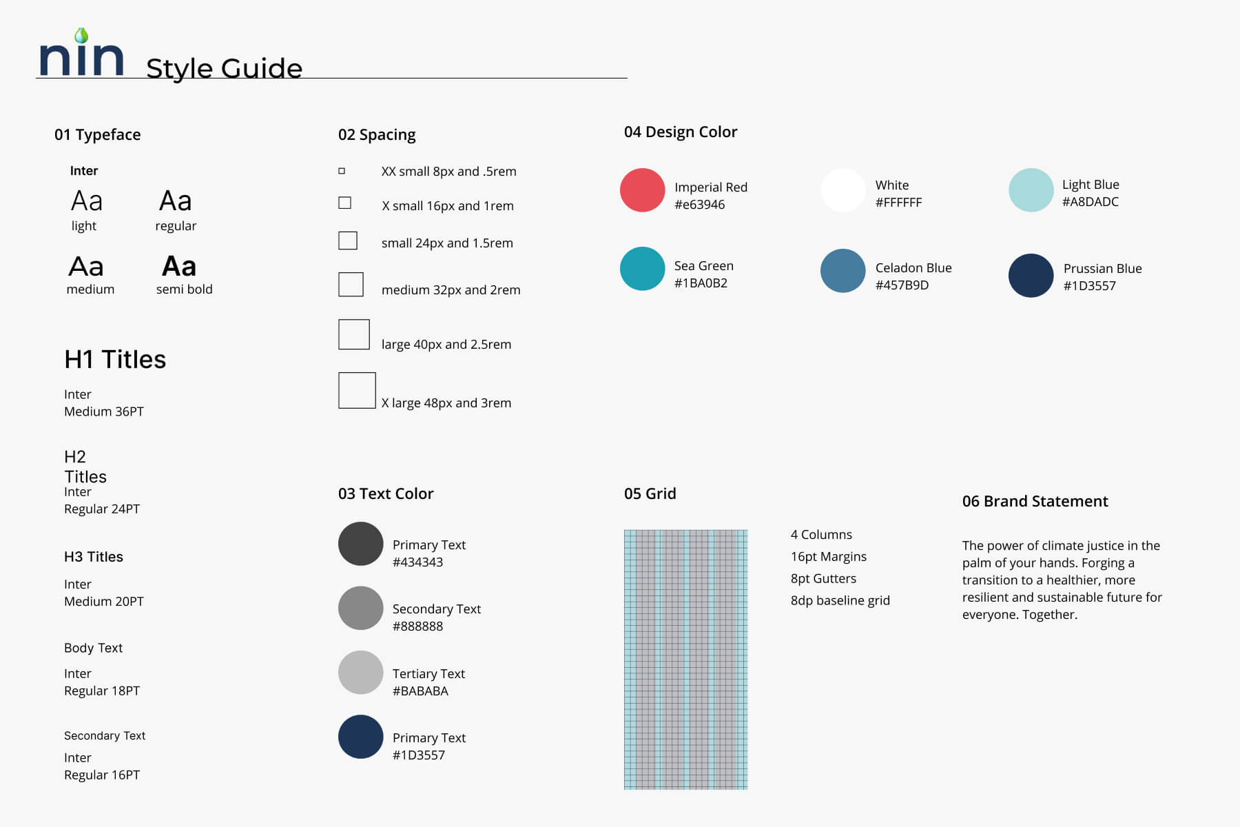
Style Guide
Mood Board
Reflection
This project turned into an exercise in reducing complexity. During the research/group phase, we attempted to turn abstract ideology around climate change policy, and individual behavior shifts into a simple, usable, and desirable product. This work is so relevant and important, and so I’m all the more glad that the visual design of the product is approachable, tasteful, and clearly communicates its purpose while feeling ‘fun’ to click around in.
I hope that this project can serve as part of a greater discussion around the impact that local communities can have around climate justice and policy. Climate activism can (and should) be made accessible, approachable, and impactful.
A Few Key Insights:
Learning to Let Go
Sometimes the brave thing to do is terminate a core feature that felt innovative in concept but doesn’t quite translate to the user understanding.
The Power of a Task List
By using daily task lists, I was able to balance my creative energy with the technical steps to bring it to fruition, by using micro-deadlines and empowering workflows.
Design Systems for the Win No matter how simple the task, I learned the importance of building a design system and sticking to it, to ensure a visually cohesive project.
Virtual UX design
Using UX tools and platforms to collaborate virtually with my team and users allowed us to take the project from concept to final prototype design without ever meeting in person.
In-Person Feedback
In post COVID times, I hope to conduct more in-person interviews and data collection throughout the design process, in order to pick up on non-verbal cues and participant context more readily.

